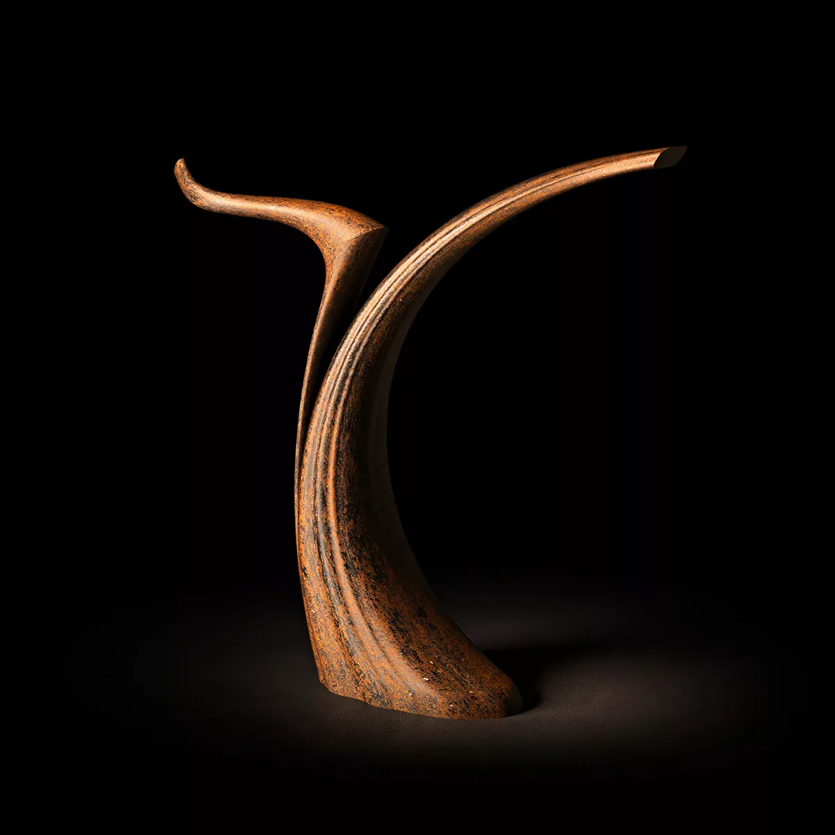
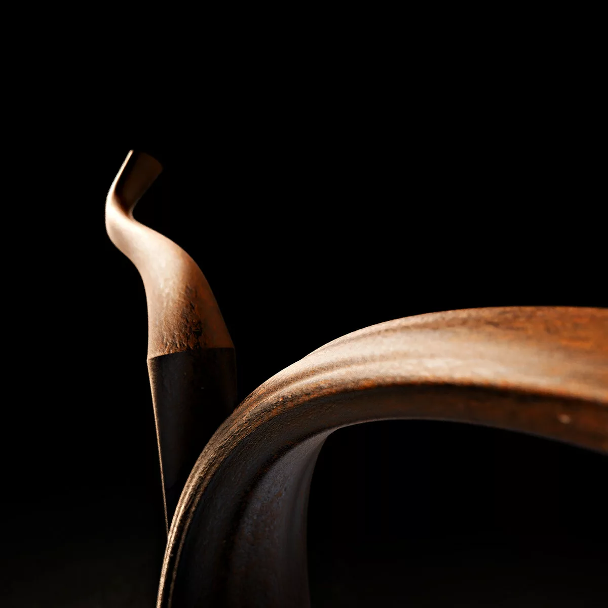
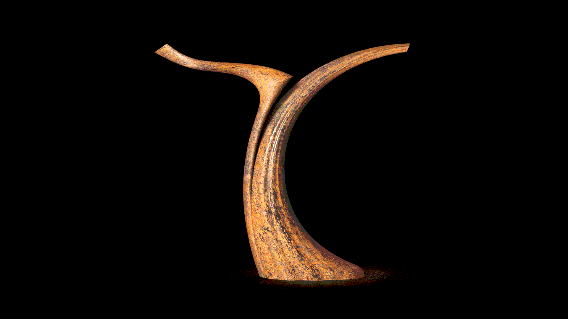
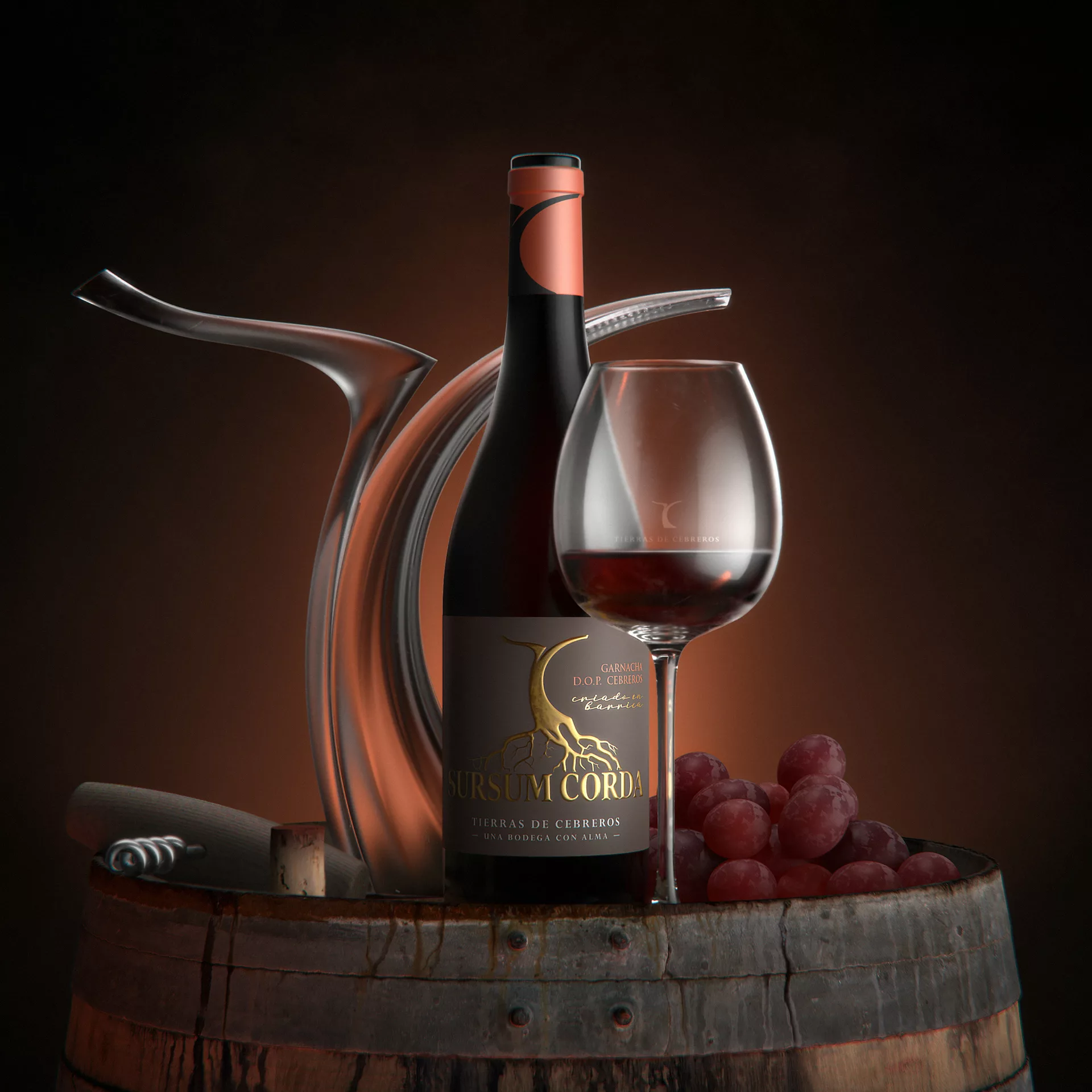
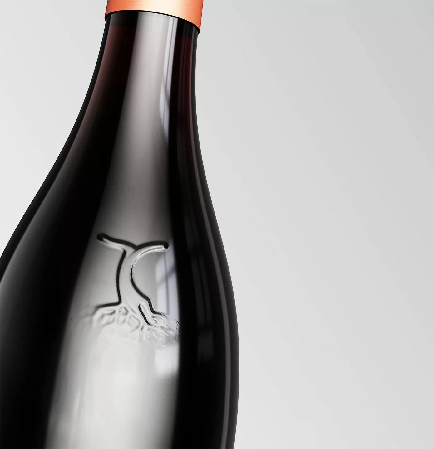
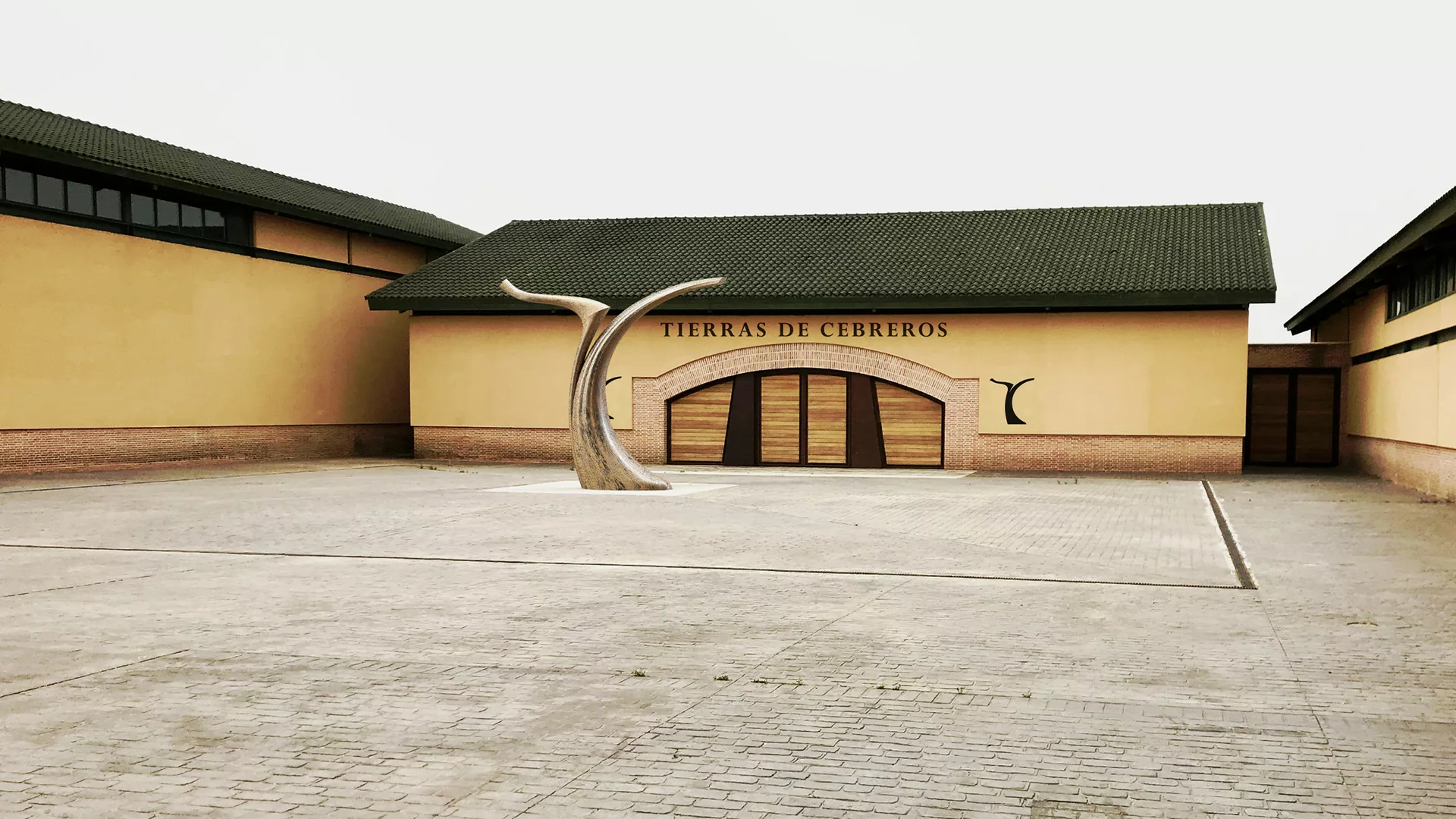
This design refocuses on the heart of the brand: the vine.
A return to the essentials with the “T” and “C” initials carved like a vine foot, expressing the strong anchorage to the vineyard and its mystical and spiritual land…
The brand blossoms in its environment and lives with it.