Product branding and packaging (structural and graphic design)
for the Mueloliva extra virgin and refined olive oils
THE COMPANY AND THE CHALLENGE
Mueloliva is located at the foot of the Subbetic Mountains of Córdoba, in the heart of Andalusia, the largest olive oil producing area in the world.
Mueloliva is the story of a family, who has made the best olive oil a way of life. 80 years ago, Mr. Mateo Muela Valesco, founder of the company, proved that with perseverance, care and respect for traditional and artisan methods (rather than mass production), the best fruits could give birth to the best oils.
Mueloliva oils are recognized worldwide with 400 international awards from 17 different countries. Its most awarded oils are Venta del Barón and Mueloliva Picuda.
Credit: Mueloliva
Our team dedicated to brand strategy, product innovation and design, has been collaborating for 25 years with the Mueloliva company, in the design and updating of their brands and packaging.
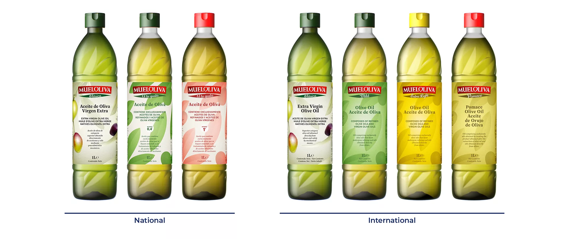
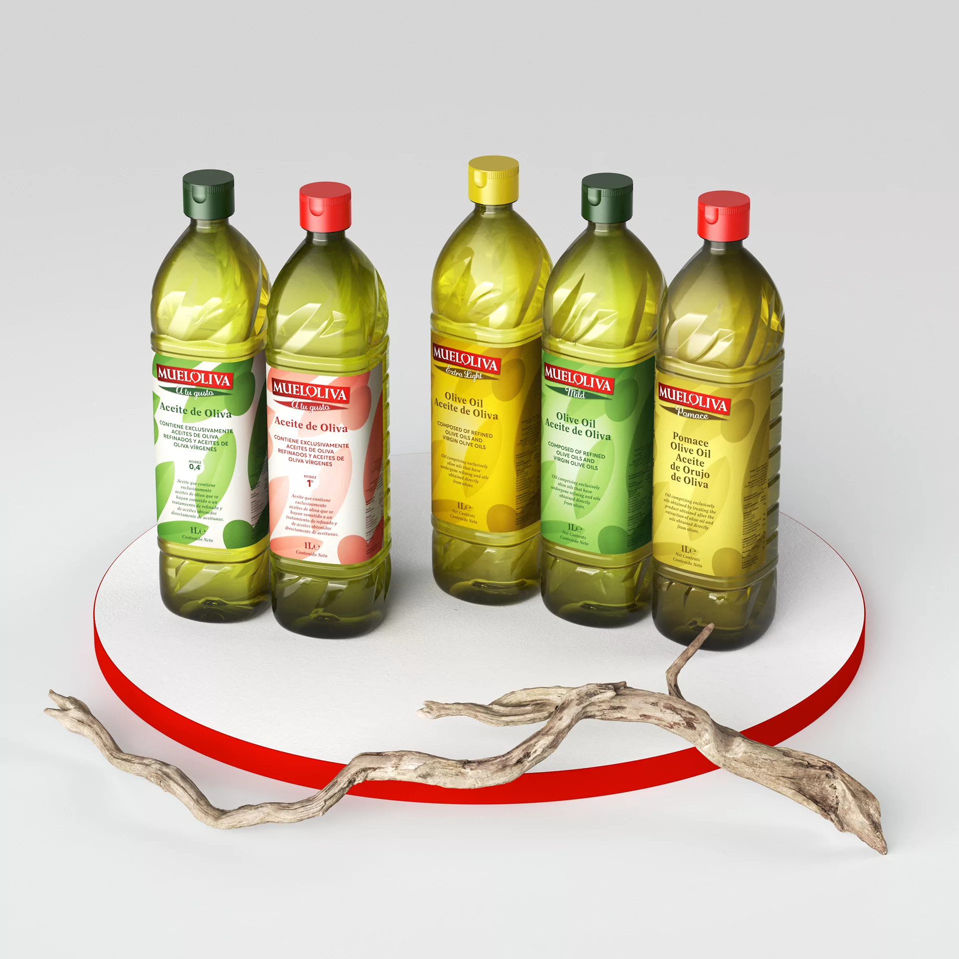
The mission of this project was to redesign the iconic PET bottle of the brand, created in the late 90s by In Spirit Design, while rejuvenating the product branding of the Mueloliva oils: 'Clásica', 'A tu gusto', 'Mild', 'Extra Light', 'Pomace'... The new bottle would gradually replace the previous one.
The approach
Our objectives:
●
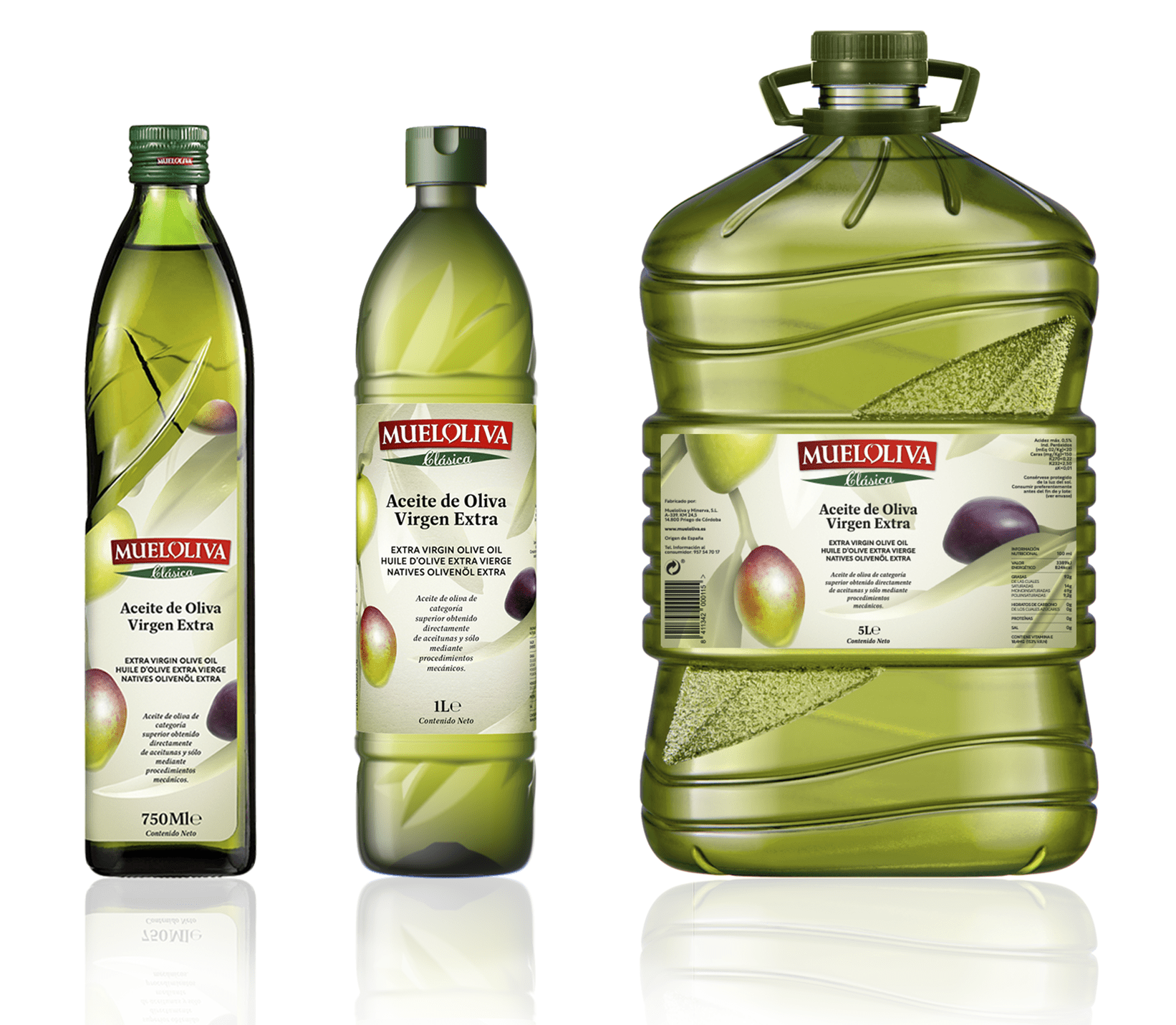
To create an up-to-date original design while keeping the brand assets, in order to keep a link with the previous design and be consistent with the other bottle formats (glass bottles and 5L PET bottle),
●
To impact on shelves, make the new bottle stand out from the competition,
●
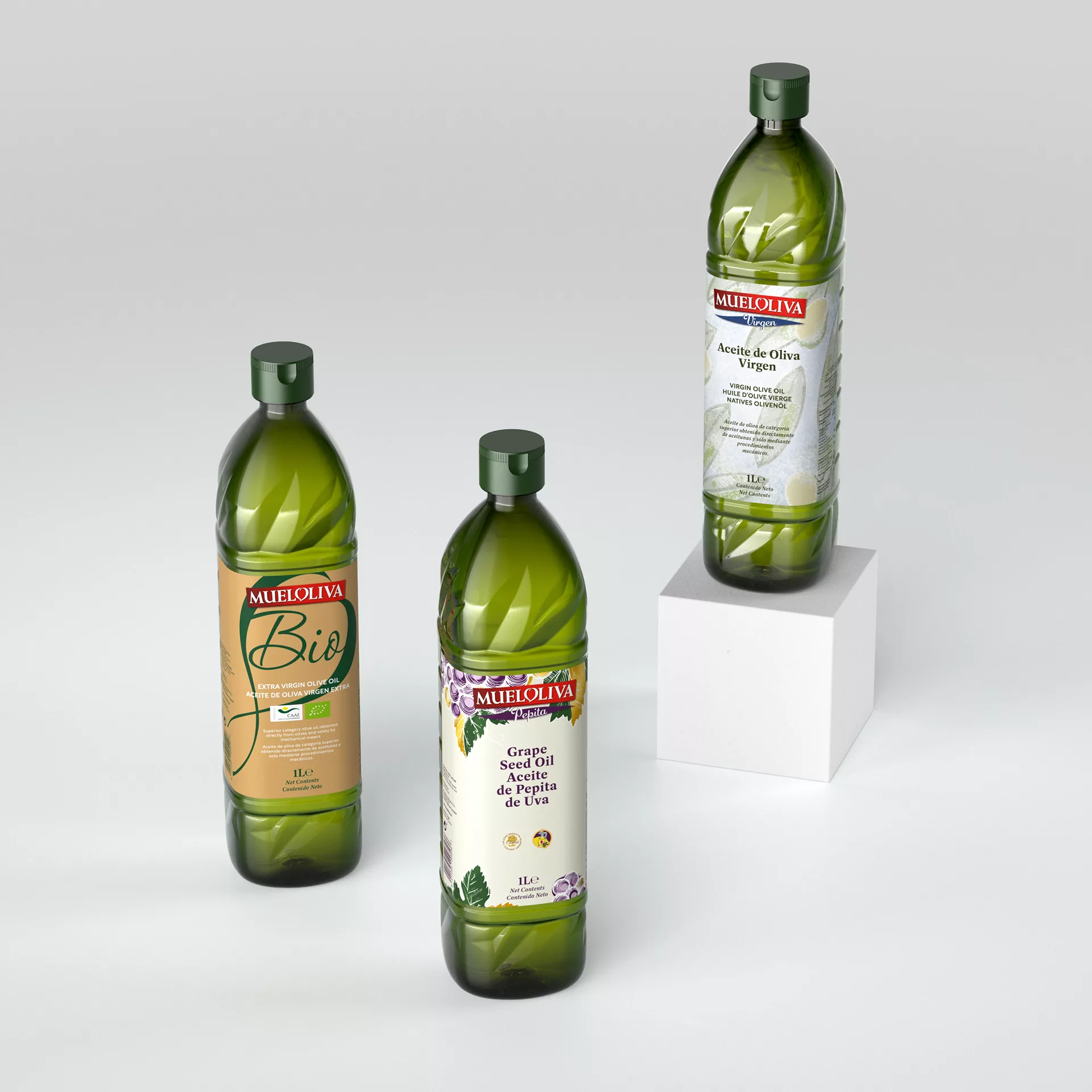
To structure the range, which would include extra virgin, virgin, and refined olive oils, as well as other oils as avocado or grapeseed oil,
●
To transmit the qualities of the products,
●
And to inform the consumers.
But also, from the technical point of view, the bottle should offer a good gripping while remaining within a dimensional framework (for filling lines, storage, logistics…) and reducing the material weight for financial and environmental reasons.
It was also necessary to increase the labeling area to allow a wider surface of expression for each product of the range.
The result
Before / After
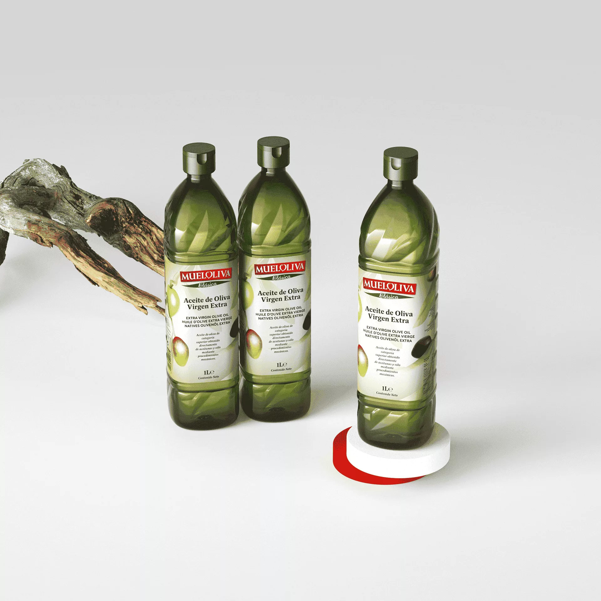
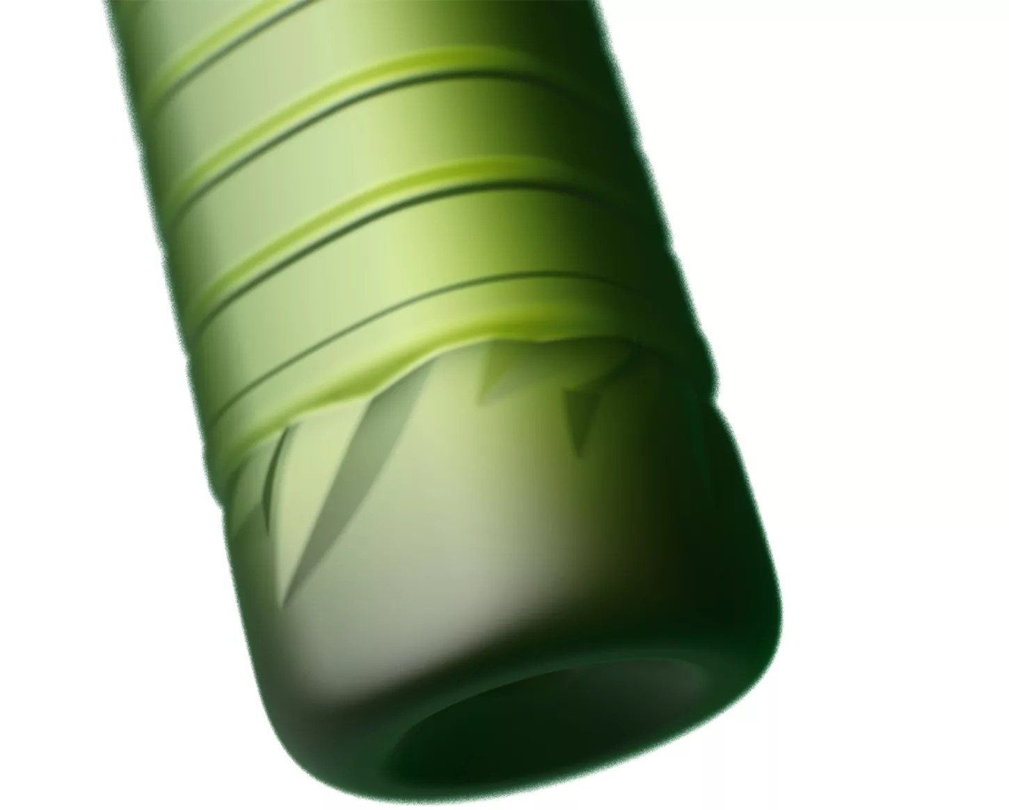
The new olive oil bottle is minimal while keeping the brand iconic olive leaves shaped into the mold, now placed on the shoulders and base.
These olive tree leaves engraved on the bottle transmit the naturalness of the product and the authenticity of the brand.
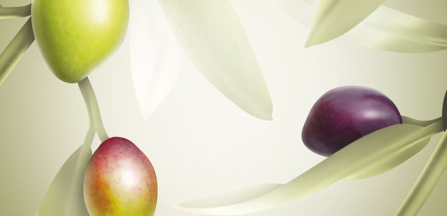
The body offers a large communication surface where the new label presents an illustration that gains in naturalness and freshness. The illustration evolves in terms of colors and graphic treatment according to the products of the range, allowing a clear identification of each product while keeping a consistent transversal structure.
An important point was to create a continuity between the shape design and the graphic design. The leaves on the bottle extend on the label. The new bottle is thus representing an olive tree branch, to make the consumers feel that they are catching a gift from nature, a natural product coming directly from the Priego de Córdoba olive groves.
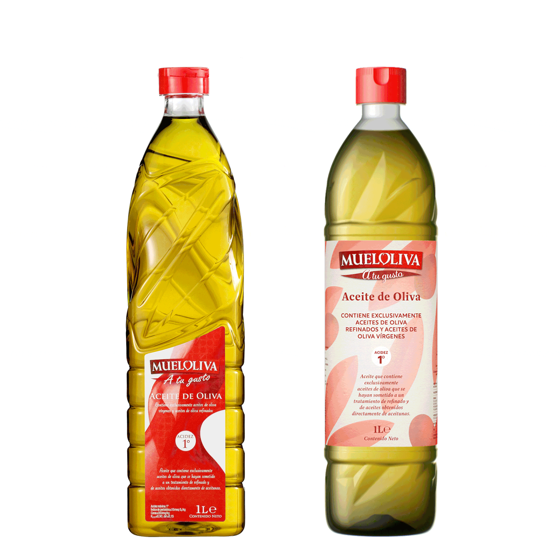
Through the very minimal, simple, and graphic illustration treatment given to the labels of the Refined olive oils
-used for cooking, frying, and baking-, we have made a nod to the joyful dresses of Andalusian folklore to convey the oils origin.
Refined olive oils
For Mueloliva Clásica, the extra virgin olive oil, the illustration is more detailed, more realistic, and thus more natural.
Digital handmade illustration
Other products of the range
Gestionar consentimiento
Para ofrecer las mejores experiencias, utilizamos tecnologías como las cookies para almacenar y/o acceder a la información del dispositivo. El consentimiento de estas tecnologías nos permitirá procesar datos como el comportamiento de navegación o las identificaciones únicas en este sitio. No consentir o retirar el consentimiento, puede afectar negativamente a ciertas características y funciones. Si desea saber más acerca de las cookies puede acceder a la política de cookies.
Funcional
Always active
El almacenamiento o acceso técnico es estrictamente necesario para el propósito legítimo de permitir el uso de un servicio específico explícitamente solicitado por el abonado o usuario, o con el único propósito de llevar a cabo la transmisión de una comunicación a través de una red de comunicaciones electrónicas.
Preferencias
El almacenamiento o acceso técnico es necesario para la finalidad legítima de almacenar preferencias no solicitadas por el abonado o usuario.
Estadísticas
El almacenamiento o acceso técnico que es utilizado exclusivamente con fines estadísticos.El almacenamiento o acceso técnico que se utiliza exclusivamente con fines estadísticos anónimos. Sin un requerimiento, el cumplimiento voluntario por parte de tu proveedor de servicios de Internet, o los registros adicionales de un tercero, la información almacenada o recuperada sólo para este propósito no se puede utilizar para identificarte.
Marketing
El almacenamiento o acceso técnico es necesario para crear perfiles de usuario para enviar publicidad, o para rastrear al usuario en una web o en varias web con fines de marketing similares.